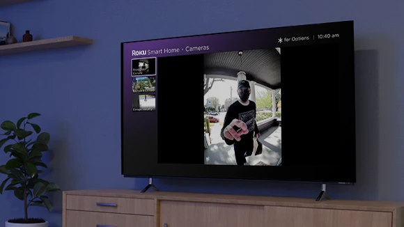
Smart Home on TV

Roku wanted to enter the smart home market, to defend its strategic position in TV streaming. As the first designer on the team, I helped bring camera notifications to Roku TVs.

Role

Lead Product Designer

Responsibility

Interaction Design Motion Design

Team

2 Designers 3 Engineers 1 Product Manager

Launch

October 2022

App Screen with open sidebar

Background

To fend off competition from Amazon and Google, Roku wanted wanted to leverage its core competency in running smart TVs to create a unique experience for our new smart home users. I worked on integrating the TV and smart home experience by enabling users to view and manage doorbell notifications on their Roku TVs and players.

Homescreen with open bottom drawer

Defining the problem

I started by understanding how users want to interact with smart home devices from their TV. Through research, UX and product uncovered 2 user needs for integrating the smart home and the TV. Given the launch timelines, we decided to focus on the ability to view the camera feed and receive camera notifications on the TV.

App Measure Weight Screen

Wireframing the layout

I defined guiding UX principles and explored different positions for the notification on screen. The focus was on ensuring the notification was discoverable, actionable and yet not intrusive to the TV streaming experience. I created 3 options, a bottom heads-up display, a top heads-up display and a bottom picture-in-picture display. The bottom picture-in-picture met all the UX goals.

Detailing the interactions

After narrowing the design to the bottom PiP display, I asked myself "what actions would the user want to take"? I mocked up different layouts for the notification, exploring options with icons and text. We decided to go for option 3 with the text to bias for clarity.

Detailing the interactions

After narrowing the design to the bottom PiP display, I asked myself "what actions would the user want to take"? I mocked up different layouts for the notification, exploring options with icons and text. We decided to go for option 3 with the text to bias for clarity.

Detailing the interactions

After narrowing the design to the bottom PiP display, I asked myself "what actions would the user want to take"? I mocked up different layouts for the notification, exploring options with icons and text. We decided to go for option 3 with the text to bias for clarity.

Simplifying the design

Through testing I realized, that the notification needed to be easier to glance since the user is focused on watching their favorite TV show or movie. To simplify the design, I opted for progressive disclosure. The user would first view the thumbnail and then interact with it.

Exploring motion concepts

I explored motion studies for the notification's ingress. We settled on the notification ingress from the left with a fade to background. This mimics the motion used in Roku's existing action HUD UI.

Exploring motion concepts

I explored motion studies for the notification's ingress. We settled on the notification ingress from the left with a fade to background. This mimics the motion used in Roku's existing action HUD UI.

Exploring motion concepts

I explored motion studies for the notification's ingress. We settled on the notification ingress from the left with a fade to background. This mimics the motion used in Roku's existing action HUD UI.

Final design

To ensure users don't receive too many notifications, we only displayed notifications from doorbells, not all camera events.

Final design

To ensure users don't receive too many notifications, we only displayed notifications from doorbells, not all camera events.

Final design

To ensure users don't receive too many notifications, we only displayed notifications from doorbells, not all camera events.